visit sierrawestscalemodels.com

O'Neills Fabrication a different take

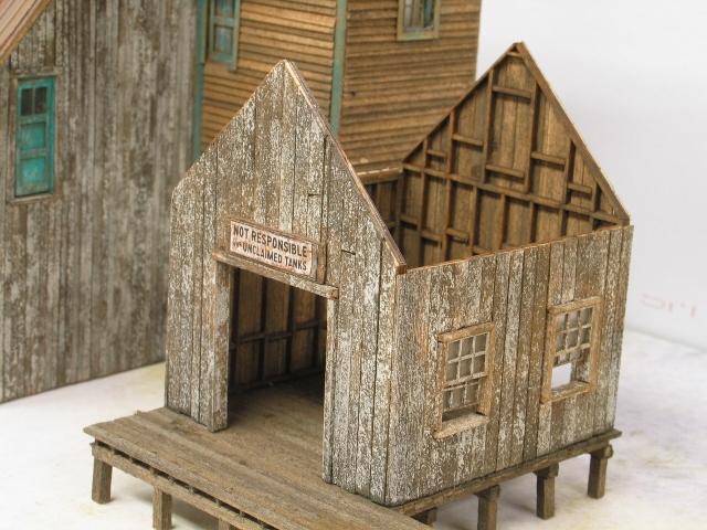
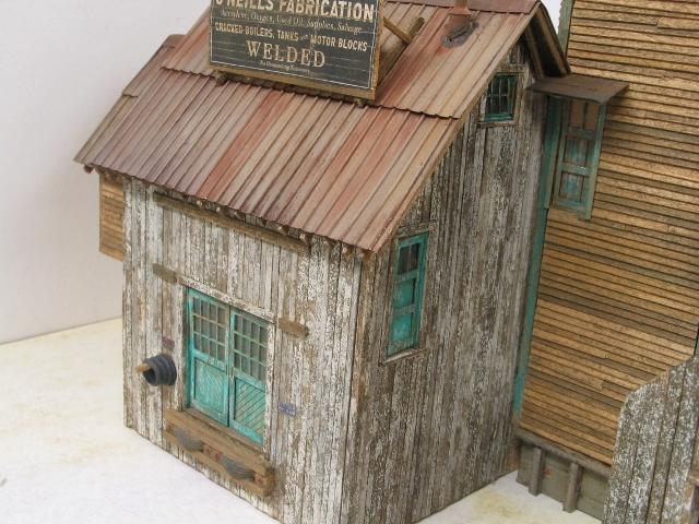
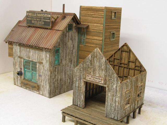
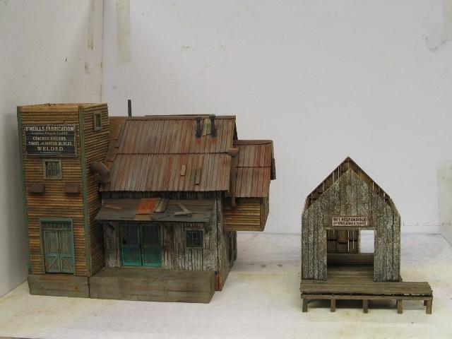
I have made some progress on this build and I think it's okay but since I model in a relative vacuum I am having my doubts. It basically looks like the other builds going on so I have decided to post my progress. Please excuse the background and just look at the model please.
IMG_0002 (640x480)
IMG_0004 (640x480) (2)
IMG_0006 (640x480)
IMG_0008 (640x480)
I painted the trim on the tower to look like it was painted before the main building. Maybe not the best idea. I could not master the brush painting technique on the white walls so I used the sponge technique.
«13

Comments

  • You have done an excellent job bringing your own feel to the structures. The ribbed roof looks wonderful. Coloration is perfect. Well done. Thank you for sharing and I am looking forward to seeing you turn the structures into the diorama!
  • edited July 2016
    Thanks for sharing Mitch. Its always neat to see the different shades of colors people chose to make their builds look unique. To follow-up on what Brett said, I too like the colors you used for the ribbed roof. I also like the shade of Aqua paint you selected for the doors and trim. The only area I saw that may need attention is the Metal Panel above the loading dock. The reason I say may, is it might just be the lighting or the camera you used...but from my perspective, it appears too bright and doesn't match the rest of the subtle tones you used on your model.

    Otherwise, looks Great!
    Alan
  • Mitch, the build looks great!
    Jim
  • You've been holding out on us Mitch! You should have been posting all along...great stuff. The Welding Shop looks terrific. I see the piece of corrugated Alan is referring to. I agree, a bit too strong of orange rust. Look forward to watching your progress...Ken
  • I like it. I agree on the bright orange rust. That color is good for "rust bloom" or rust that hasn't had a chance to age, but it turns dark pretty quickly in nature. The sponge technique works. There is nothing wrong with "making it yours". I think you're supposed to do that. If we all had exactly the same results, well, how boring would that be?
  • Nice start. I don't see anything that is not subtle about your build-to reference your post on another thread. I'm not opposed to the roof color. If you want to tone it down, that could be done easily by lightly brushing some of the chalk off and/or adding some ink/alc. Same with the wall paint. If you like it, leave it alone. To tone down, add some chalks and/or ink/alc. These are very forgiving techniques.
  • edited August 2016
    I would like to thank everyone that was kind enough to leave a note of encouragement. I dropped the main building on a concrete floor about ten days ago and the pieces went flying. The pictures I posted are after the rebuild. For whatever reason, my tower was bigger than the concrete pad underneath it. So to compensate I had to move the concrete porch over. The space on the right of it was intentional and not a result of the accident. I will cover that space with something.

    Its been a long time since I've posted anything so I forgot to adjust the white balance on my camera to fluorescent. I adjusted the camera for the pictures below. That bright orange panel on the roof in the previous picture is not as bright in person.


    IMG_0002 (640x480)

    It's still probably too orange and I will adjust it

    IMG_0004 (640x480)

    IMG_0005 (640x480)
  • edited August 2016
    That's one amazing story and recovery. Never would have know it fell and was repaired! In regards to the tower foundation casting. I just measured the batch I have on hand, same mold as yours was poured in, and they are all exactly the same size as the one on my pilot model. Lets talk on the phone tomorrow.
  • As the title indicates, mine is a little different.

    IMG_0001 (640x480)
    IMG_0003 (640x480)
    IMG_0008 (640x480)
    IMG_0014 (640x480)

    I weathered the walls of the tower so they would not look like they were made of new railroad ties. I just felt like the extra staircase would fit in behind the tank and not detract from anything.

    Mitch
  • I like the extra stairway...looks great!
  • Love that last shot Mitch! Great vision and this further illustrates the versatility the modeler has in building SWSM kits and the individuality that can be built into them. My eye is drawn to the great paint peel on the Main Building...Ken
  • A little more progress on my build. The roofs on and against the welding shack are just leaning on the building. The white spots on the roof need to be blended out. In my build I Iike the tar paper more than the look I am getting with the corrugated roofing.


    IMG_0006 (640x480)

    IMG_0009 (640x480)

    IMG_0012 (640x480)

    IMG_0013 (640x480)

    I am finally getting to the tank.

    Mitch
  • Looks awesome Mitch. I especially like your roof work.
  • I think your corrugated treatment looks great. Would have like to have seen the drive through roof all corrugated as nice as those panels are looking Mitch. Your tar paper does look good, I like the subtile splotchy appearance. Really like the coloring you achieved on the welding shop roof. Roof work is so important as its often the first thing folks see when looking at a diorama. Well done...Ken
  • Roof looks good. How about throwing a tire or cinder block up there?
  • Thank you for your comments Alan and Bryan. I can always use the encouragement.

    Ken, I have just enough corrugated panels left to make another drive through roof using them. I will build it and see if its worth posting.

    Mitch
  • edited August 2016
    I really like the look that you're obtaining. Very different from the other builds, but equally as authentic. Phil
  • Looks great Mitch, your corrugated metal panels look great. I like the green trim on the tower also, adds a different touch.

    -Steve
  • Fantastic Mitch! Really like where you are taking this...
  • A little more progress on my build.

    IMG_0008 (640x480)
    IMG_0006 (640x480)
  • Neat weathering on the tank..and oh yeah, you're definitely sticking to your "different take" motto on this build with the Aqua Green Stenciling...
  • I like the variances. Good job. Phil
  • Thank you for commenting Alan and Phil. Phil, I assume you mean the differences in my color choices?

    When I look at the O'Neills lettering on the tank in person I can barely see the letters. When I photograph the tank the camera brings out the lettering much more than they appear to my eye. I do not understand it. Maybe someone can tell me what is happening?

    Mitch
  • Hey Mitch if it looks good to you that's what counts. Color choice is a very personal taste kind of thing so I look at the overall finish, which your's is coming along great. I like the large timber support ends, nicely weathered and detailed.
  • Ken, I would like the viewers to see what I am seeing. My camera is set to fluorescent lighting and to the highest F-stop it can muster. Otherwise its up to the camera. It is really highlighting the aqua and blowing past the weathering on top of it. I really do not like the way the picture looks but that's what I get.

    Mitch
  • I'm certainly not qualified to give any photography advise that's for sure. Have you tried a shot outside to see what happens? I frequently have to mess around way to much to get the look I want...!
  • Ken, I am not expecting you to come up with an answer for my problem.

    I am enjoying following your build. Thank you for commenting on mine.

    Mitch
  • Mitch, yes I did mean your choice in colors. I'm also ok with slight variances in the build. This is where you are show your creative side. I can't remember if you did it, but someone added an extra staircase. That's really cool and it looks good. Phil
  • It has been a while since I posted anything. I cut out the base in plywood which is what I used in all my other builds except the shipyard. It works for me. It has the first layer of dirt fastened to it. The structures are just posed on the base. Only the main building is glued to it right now. So if things seem loose or unfinished they probably are. The O'Neills lettering on the tank, at least in these pictures, looks more like they do in person.


    IMG_0001 (640x480)

    IMG_0003 (640x480)


    IMG_0006 (640x480)

    IMG_0008 (640x480)
  • Very nice Mitch. Not sure if you did anything to tone them down or its just a better quality picture...but the letters look much better. Now all that's left is the paint and weather the 1000 different castings. Thanks for sharing your pictures with us.
Sign In or Register to comment.