
Howdy, Stranger!
It looks like you're new here. If you want to get involved, click one of these buttons!
Categories
- 983 All Categories
- 3 Picture Posting and Resizing
- 57 New Member Introductions
- 119 Off-Topic Forum
- 4 Photography
- 2 Resources
- 17 New Product Information
- 168 The SierraWest Forum
- 10 Brett's Blog
- 119 General News & Ramblings
- 3 Re-Release Information
- 6 Q & A about SierraWest
- 9 What Would You Like to See?
- 402 Builds
- 143 HO Scale Builds
- 177 O Scale Builds
- 62 Finished SW Build Pics
- 15 Miscellaneous Builds
- 193 Techniques
- 19 Working with Wood
- 22 Painting Castings
- 5 Masonry
- 23 Scenery
- 37 Tools and Supplies
- 21 Layout Planning & Building
- 40 Miscellaneous
- 24 Prototype Information
- 22 Reference and Research
Peeling paint opinion

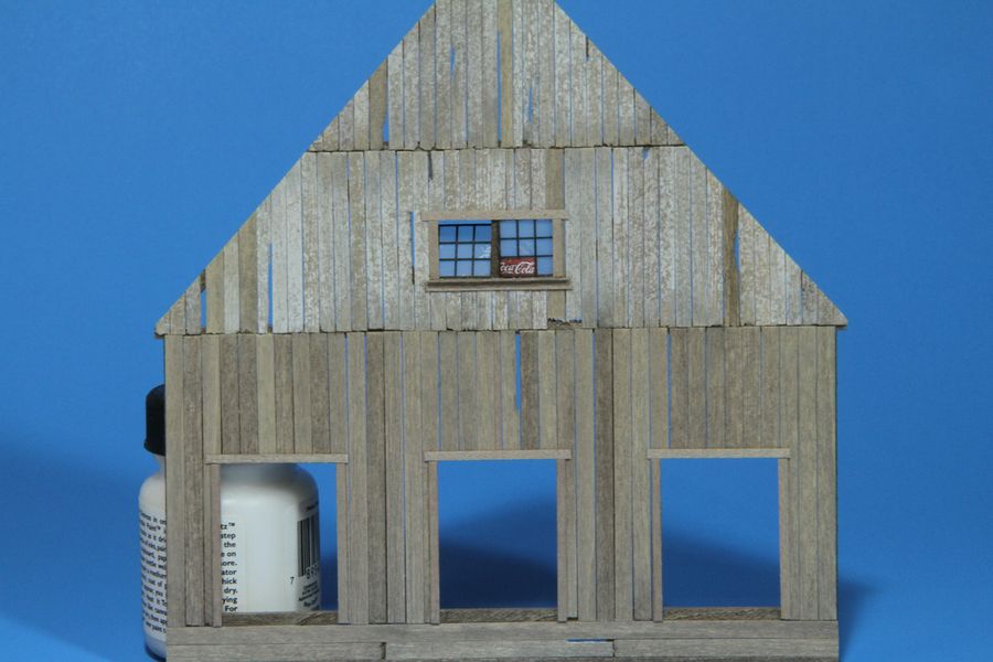
Anybody want to put a second set of eyes on this peeling paint effect? I'm pretty happy with the way these two turned out:
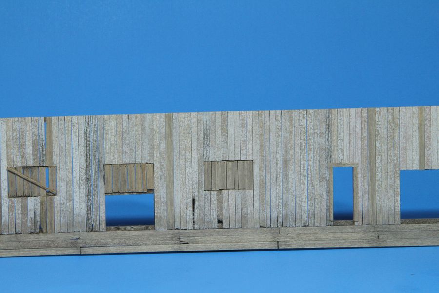
But the front wall has me frustrated. Something doesn't feel right to me:
I was thinking they look too speckled. But maybe it's not the peeling paint boards at all. The two blond-ish colored boards in the middle or the really dark one about 4 boards to the right throwing things off? Or maybe I should just chill out and leave it.
My wife's boyfriend hit me in the face with a tire iron once, so if you tell me what you think...it ain't gonna hurt my feelings!
Comments
If so it also looks like you also only did it once....?
This for me is why it looks speckled.... it has no depth.
To use this method with improved results, repeat it lightly over the boards again. I usually do three layers.
What this does is create varying depths in the peel effect and it also eliminates the speckle effect due to the over lapping layers.
Unfortunately your first layer may be too heavy/solid to repeat it more than once without obliterating the effect.
Three to four sparse layers with Brett's terry cloth method can reveal a great peel effect that is easily repeatable. It takes a little time, but, the extra effort is well worth it.
I havent read the "Twin Mills" manual (yet) but, when Brett describes his method in other manuals the layering is mentioned.
I also agree that the boards without the peel effect stand out too much and provide too much of a contrast.
Try toning down the peeled white paint a little, (if it is old enough to have peeled that much what is left would not be clean stark white).
Also the plain grey boards are too dark in my opinion and create too much contrast with the white. Some white chalk could lighten these up . However, if these are replacement boards, would they be a more aged and darker grey than the original siding......????
questions to ask yourself, and just my observations, take them or leave them, but hopefully they will inspire some more discussion and ideas.
The first two walls look great in the first two pictures. The last wall looks to be unfinished and it is this wall that my comments are directed towards. I dont think anything needs to be done to the first two.
Karl.A
This is what I needed to hear. Thanks for telling me.
Yep, I'm using the terry cloth method and most boards only got one coat. I put two coats on several of the side wall boards but held off on the front because I thought I was losing the "peeling" effect.
If it's not too much trouble, would you point out which ones look correct to your eye? That would help me out a lot in trying to replicate the effect.
I think I may be able to mask off individual boards with painter's tape and adjust the color one board at a time right on the wall. I'm also going to get a different towel. The one I used was brand new, but it came from the dollar store. I think if I spend a couple dollars and get a really nice one, the terry loops will be tighter and help things look less speckled. OR, I'm not opposed to popping off individual boards and fixing them.
Sound like a plan?
Anyone else with ideas or suggestions, please jump in.
I really want to do a good job on this because it's the first structure people will see when it's on the layout. Failure is not an option!!
Let's see if this looks a little better:
The wall on the left still looks alittle bit stripey/contrasty.... but .... it is completely out of context.
Once it is put together with other walls, and the deck,.... and, .... and,.....
Right now 'we' are focusing on one wall, which looks great, but 'something' feels out of place.
My advice would be to place as many walls together as is feasable and then evaluate them.
I'm sure you will find that this wall, within the larger picture, will need no further adjustments once it is in perspective.
Karl.A