
Howdy, Stranger!
It looks like you're new here. If you want to get involved, click one of these buttons!
Categories
- 983 All Categories
- 3 Picture Posting and Resizing
- 57 New Member Introductions
- 119 Off-Topic Forum
- 4 Photography
- 2 Resources
- 17 New Product Information
- 168 The SierraWest Forum
- 10 Brett's Blog
- 119 General News & Ramblings
- 3 Re-Release Information
- 6 Q & A about SierraWest
- 9 What Would You Like to See?
- 402 Builds
- 143 HO Scale Builds
- 177 O Scale Builds
- 62 Finished SW Build Pics
- 15 Miscellaneous Builds
- 193 Techniques
- 19 Working with Wood
- 22 Painting Castings
- 5 Masonry
- 23 Scenery
- 37 Tools and Supplies
- 21 Layout Planning & Building
- 40 Miscellaneous
- 24 Prototype Information
- 22 Reference and Research
Shadow effect to create depth

Since the Expo I've been working on a couple non-Sierra West projects, but I hit on something pretty simple that I wanted to share with you guys. As I was weathering up the exterior of a wooden clapboard building, the windows still seemed to look to "new" or out of place or something. I switched from the light browns and grays I was using over to a much darker gray and added a tiny bit under the sill. That made a noticeable difference and solved my little mystery for me.
My "in progress" pictures are crap since I thought I'd do it fast and use an the iPad, but here goes...
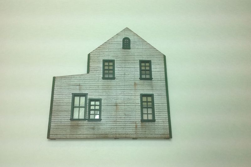
This is the wall that I weathered prior to adding the shadow:
By using a really dark gray chalk (not black) and a small stiff stencil brush, I applied a small amount of powder tight to the bottom of the sill and scrubbed back and forth a bit. Then blew the chalk away.
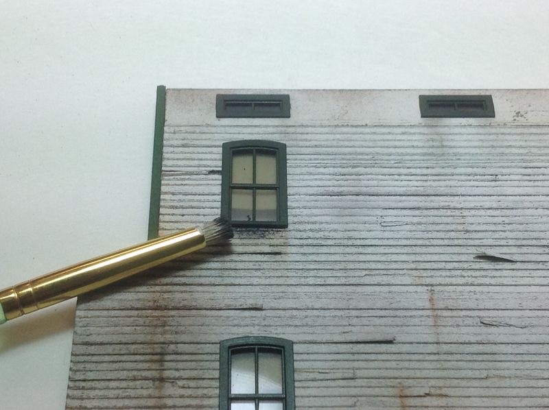
If needed, I would come back with a soft make-up brush and blend a little more. It's subtle, yet the amount of depth the gray chalk adds is noticeable but quite natural I think and makes the wall pop. Since the gray is a completely different color than the tans, rust and browns I was using for the weathering effects, I think it establishes a "shadow" feel pretty convincingly. This window is probably the best illustration of what I'm trying to demonstrate. The others are my first couple tries at it.
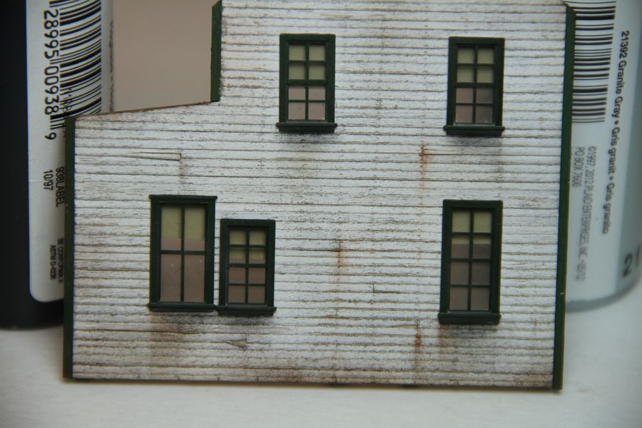
I'm not sure how well this works with darker wood, but I bet it will add a similar effect. The only change would probably be the need for more or darker gray chalk.
Bill
My "in progress" pictures are crap since I thought I'd do it fast and use an the iPad, but here goes...
This is the wall that I weathered prior to adding the shadow:
By using a really dark gray chalk (not black) and a small stiff stencil brush, I applied a small amount of powder tight to the bottom of the sill and scrubbed back and forth a bit. Then blew the chalk away.
If needed, I would come back with a soft make-up brush and blend a little more. It's subtle, yet the amount of depth the gray chalk adds is noticeable but quite natural I think and makes the wall pop. Since the gray is a completely different color than the tans, rust and browns I was using for the weathering effects, I think it establishes a "shadow" feel pretty convincingly. This window is probably the best illustration of what I'm trying to demonstrate. The others are my first couple tries at it.
I'm not sure how well this works with darker wood, but I bet it will add a similar effect. The only change would probably be the need for more or darker gray chalk.
Bill
Comments
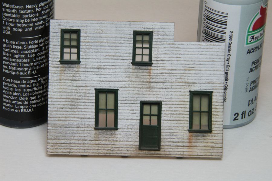
As you say, the others being 'experiments' don't quite have the same effect.
I think if the shadows were tighter to the sill and not as grainy as the 'experimental' ones it would be a step in the right direction. Too far from the sill and it starts looking like a bad attempt at water run-off.
Also I think the first one looks better with the shadow starting in from the edge of the sill, as if the sun weren't directly over head.
Having the 'shadow' directly under the entire sill doesn't look as good.
Just my thoughts, disregard at will, I do like the concept and the direction you are taking.
Karl.A
And for those of you following along…THIS is the reason to post pics here. Karl's got of set of Eagle eyes like no other!